 Skip to content
Pantone Colour of the Year 2022: Very Peri
Pantone have announced that their colour for 2022 is Very Peri.
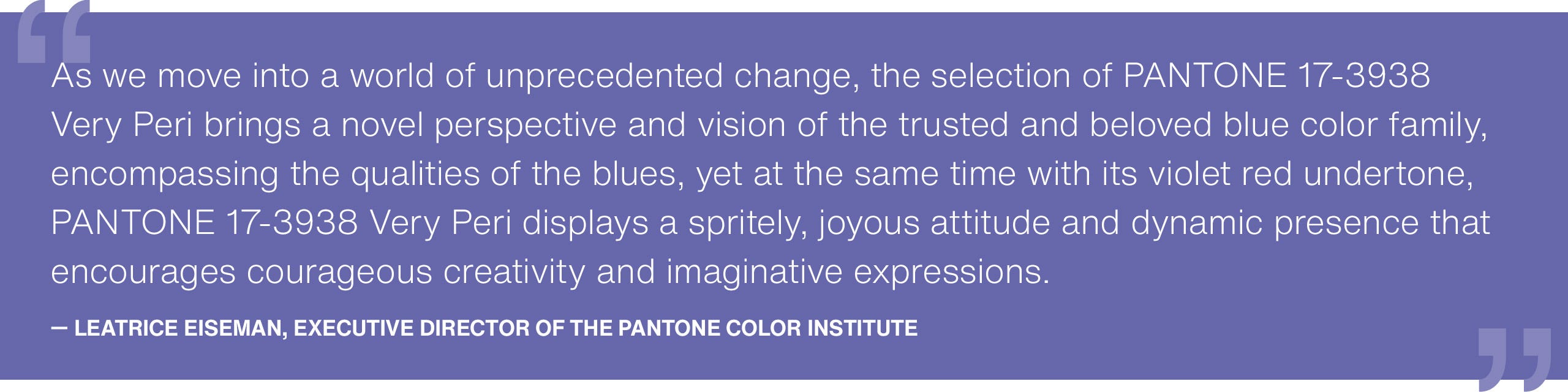
Described as, "displaying a carefree confidence and a daring curiosity that animates our creative spirit, inquisitive and intriguing PANTONE 17-3938 Very Peri helps us to embrace this altered landscape of possibilities, opening us up to a new vision as we rewrite our lives." In essence, this striking colour is blend of blues with a violet-red undertone. Imagine, Lavender for the 2022 generation.

Credit: www.pantone.com
Here at Slay My Print we have a wide range of prints to compliment this bold new colour in your interior. If your home has a maximalist style or if your are brave enough to paint Very Peri on your walls, our timeless black and white photography posters will help to ground the colour and add a sophisticated touch to your decor.

If you want to introduce Very Peri to your home but aren't quite ready to paint your walls with this colour, we have a range of prints that capture the aesthetic of the Pantone Colour of the Year 2022.
Adding our Very Peri inspired prints to a dark green wall is a great way of bringing the colour to your home in a stylish way. Here we have used our Oak Picture Frames to create a cosy interior.

Pantone describe Very Peri as a colour that encourages creativity so why not add one of our abstract illustrations to your interior? A fun line art print or an abstract paint texture will bring life to your home and showcase your creative side!
Our Studiiio Paris prints perfectly combine the colour Very Peri with the creative energy that it symbolises. These posters look great as pair in bold black picture frames or as part of a gallery wall (as shown above) in natural oak frames. Your choice of frame can really change how a print feels in a space so to create a harmonious living space, keep your frame colour the same as your existing furniture.

There's no denying that Very Peri is bold colour choice and whilst it may not be to everyone's taste to use for their interiors, it is certainly a colour with intention. The interiors world has seen grey and beige as the dominating trend colours over recent years so maybe it's time to be brave and embrace a new style for your home!
Laurie Pressman, Vice President of the Pantone Color Institute recently said; "As society continues to recognise colour as a critical form of communication, and a way to express and affect ideas and emotions and engage and connect, the complexity of this new red violet infused blue hue highlights the expansive possibilities that lay before us”.


Leave a comment